Skip to Content

These Are the Biggest Color Trends To Keep An Eye On In 2022

We're expecting it to be a much brighter year than the last!
By
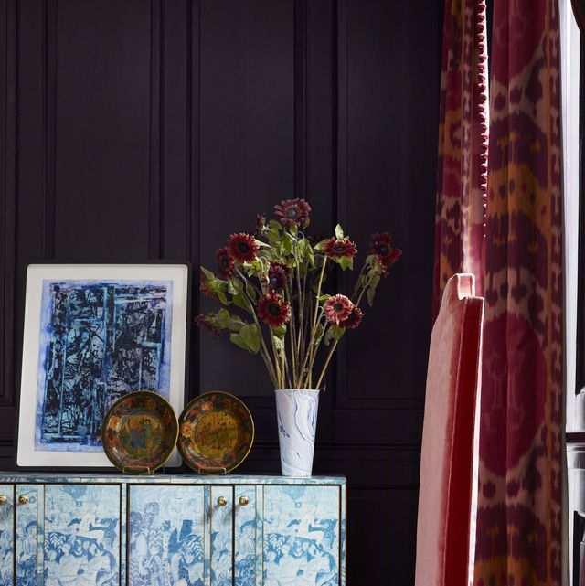
a blue and white credenza sits against an eggplant colored wall in a library
Brie Williams

Every item on this page was chosen by a Veranda editor. We may earn commission on some of the items you choose to buy.

The colors we surround ourselves with can directly impact our emotions. Choosing the right dining room paint color or the best pop for living room paint colors can make all the difference in uplifting the mood of any space. And after two rather tumultuous years, more and more design enthusiasts are turning to color to liven up their homes and create spaces of inspiration.

Knowing where to start when finding the right hues for your home is always the hardest part. Luckily, leading design firms and paint brands make it easy to start down the path to a colorful future with their indispensable knowledge on trends in the industry. Many color experts and decorators agree that 2022 is the year for new beginnings, and shades that embody this sense of rejuvenation will skyrocket in popularity this upcoming year.

We're talking earthy tones evoking the natural world, warm neutrals ushering in calmness, and golden yellows brightening every environment. Plus, vivacious green shades along with sultry hues are also predicted to make a bold impact as the year's go-to accent shades. For those color enthusiasts looking for inspiration, here are the six shades and tones that will dominate in 2022.

1

Gray-Green

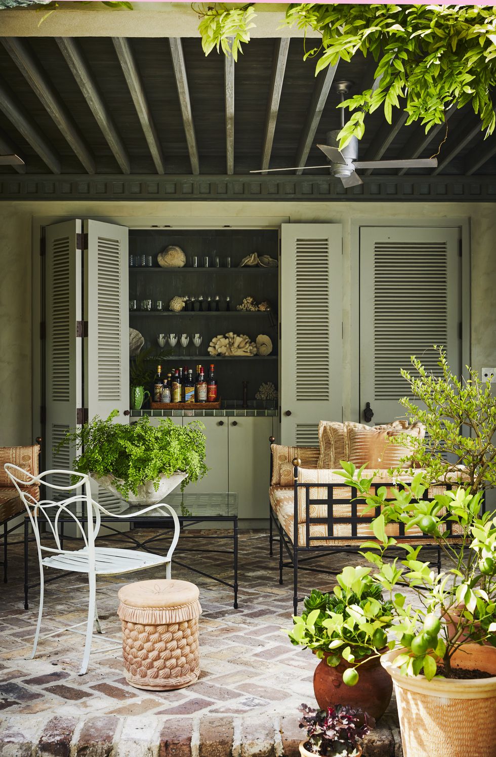
poolside drinks are served from a glazed tile bar behind folding louvered doors
Brie Williams

Leading paint companies Benjamin Moore, PPG, and Sherwin-Williams all agree: 2022 is the year for gray-green. The sophisticated hue symbolizes balance and harmony often seen in the natural world. The hue is subtle enough to be used in many ways throughout the home such as pop of color on the kitchen cabinetry or a colorful welcome in the entry.

Here, designer Ceara Donnelley painted the louvered doors of her poolside bar Mizzle by Farrow & Ball. The soft green shades just enough vibrancy to the space while complementing its surrounding greenery.

2

Earthy Tones

cathy kincaid dallas entry
Björn Wallander

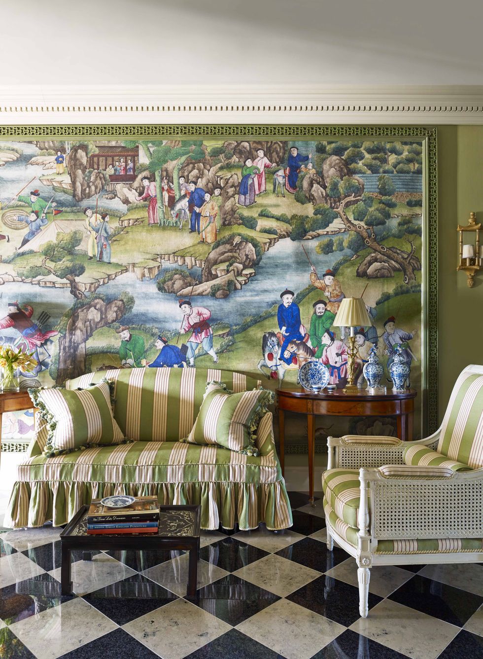
Gray-green isn't the only organic hue catching our eyes for the upcoming year. A matter of fact, many designers predict that greens of all undertones and shades will skyrocket to popularity as people yearn to bring a sense of nature into their homes. Expect fabrics featuring emerald or leafy green tones (similar to the one covering the settee in this Cathy Kincaid-designed entry) popping up all over the market in the coming months.

"Earthy neutrals and nature-inspired greens are going to be the go to colors for 2022. Shades of green are on the rise from sage to deeper tones. You can always count on a rich shade of green to evoke the calming, enveloping spirit of the great outdoors. Current Mood, a deep, moody green with cool undertones, has long been a social media favorite — and one of Clare’s best-selling hues. Warmer greens, like Matcha Latte, are perfect for energizing any space with a burst of color that draws from natural greenery. If you’re looking for the perfect balance of boldness and versatility, green is certainly for you." —Nicole Gibbons, Founder of Clare

"Green will be a color to look out for this coming year. A light grey-green, sage green, and an emerald green. Light hues of green are a great color of kitchen cabinetry as they add a bit of color without overpowering. A velvet emerald lounge chair in a living room adds a great pop and allows for conversation. The color green gives a feeling of peace and represents nature. The calming effect of nature is perfect for your home as it should be a place that allows you to relax after a long day." —Susan Spath, Susan Spath Interior Design

3

Citron

golden walls in the newly added family room are painted white
Annie Schlechter

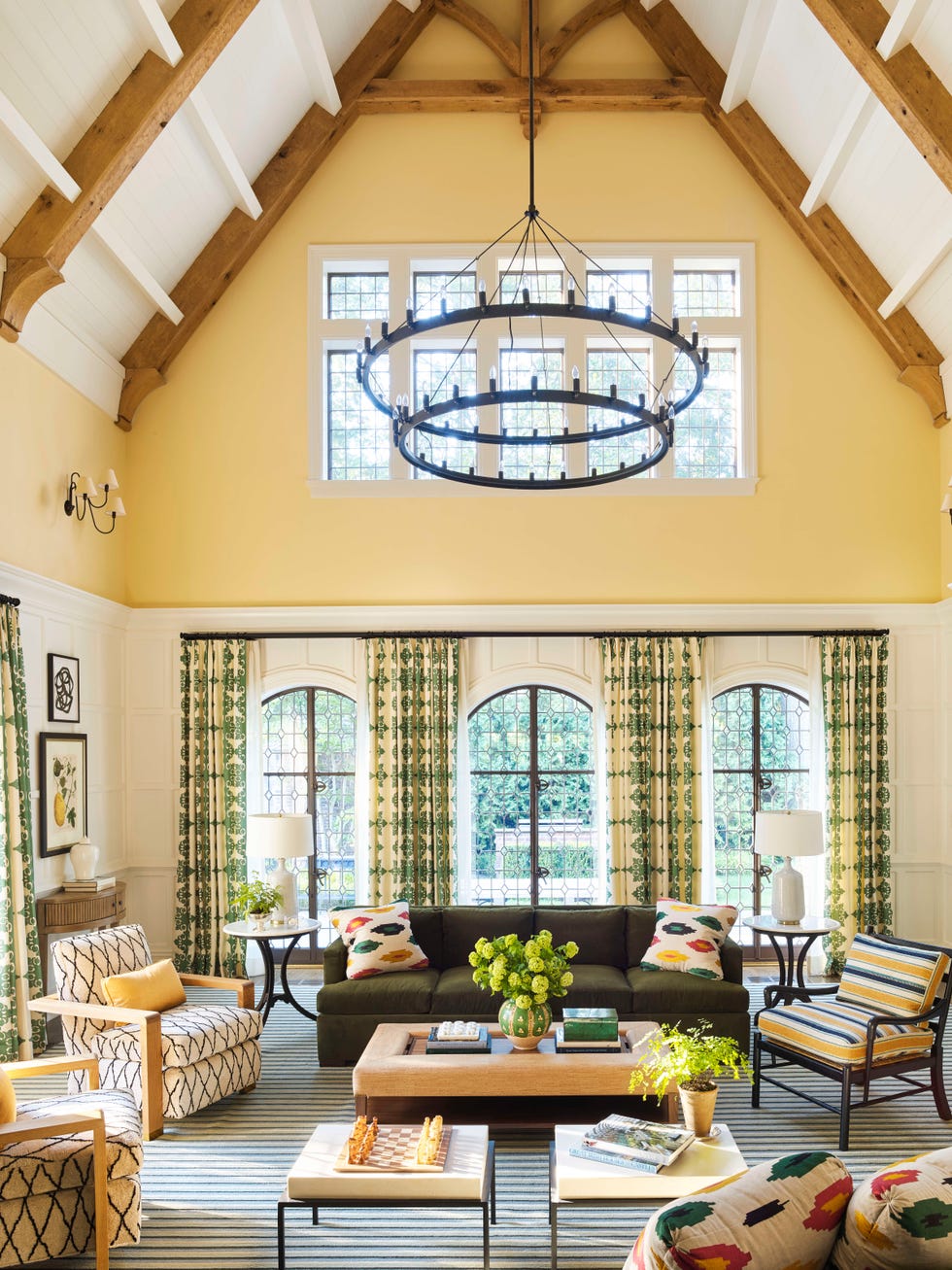
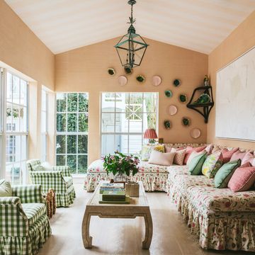
In the past, yellow has had a bad reputation for feeling dated and overwhelming. However, sunny shades are making splash in the design scene once again as people look for ways to warm up their home. In particular, buttery and citron tones resembling the petals of a sunflower seamlessly energize any space they are deployed in.

"Look out for nature-inspired hues like earthy olive greens and citron yellows. Think of colors that are grounding and calming but also uplifting and cheerful, for simple, natural and beautiful spaces."—Mindy O'Connor, Melinda Kelson O'Connor Design

Here, golden walls add a youthful glow to this family room by Carrier and Company. The walls are painted Standish White by Benjamin Moore.

Advertisement - Continue Reading Below
4

Deep Aubergine

a blue and white credenza sits against an eggplant colored wall in a library
Brie Williams

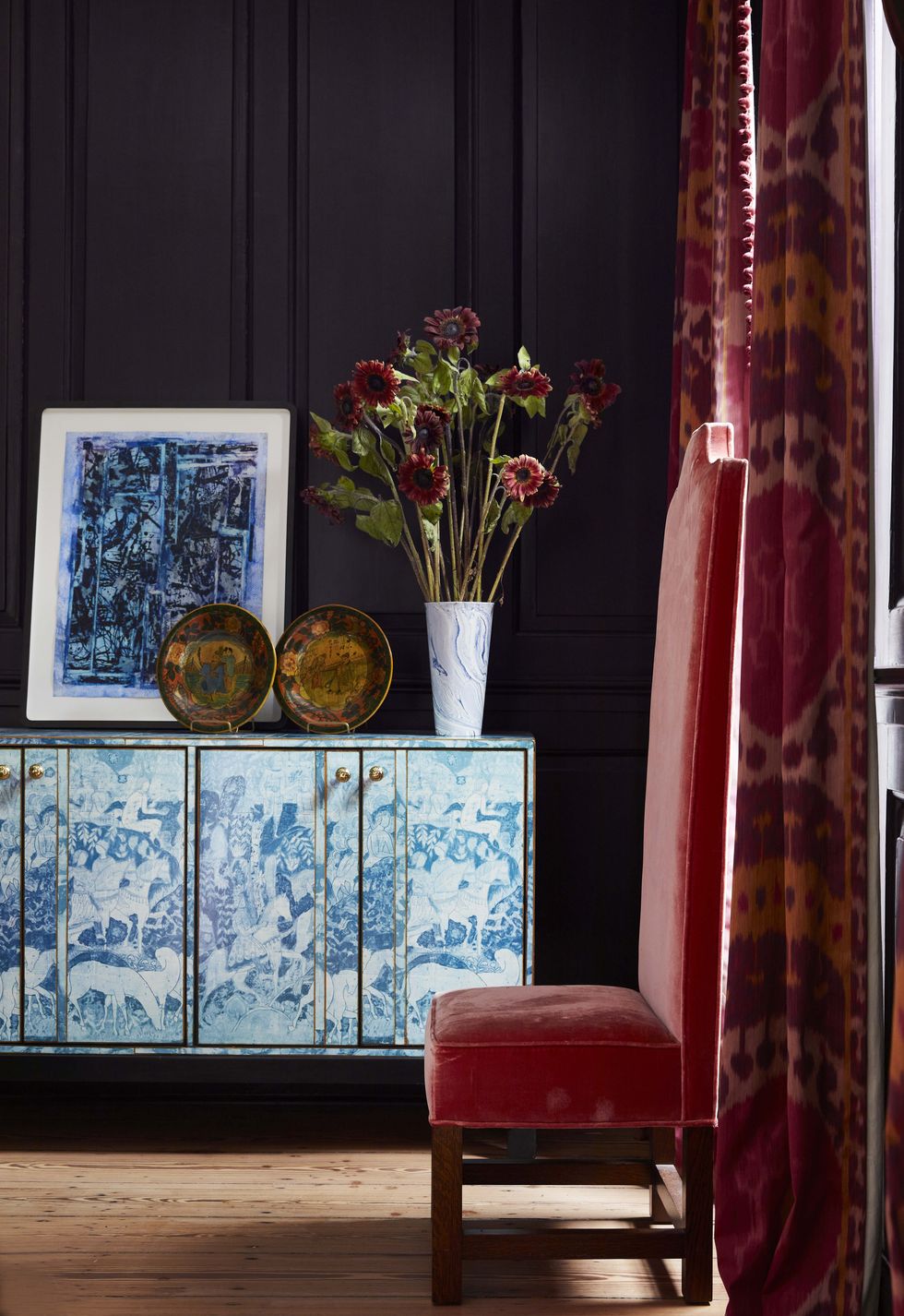
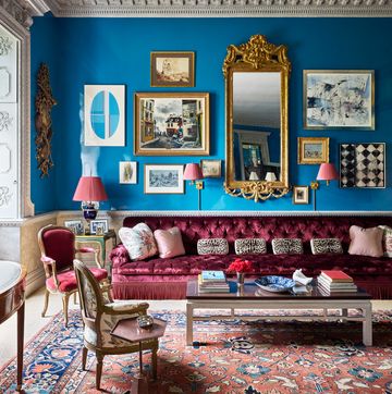
“We are loving the mixed use of almost black hues. Instead of always using traditional black, we like to add a twist by utilizing colors such as a deep and dark aubergine. The use of dark hues can be incorporated into interiors anywhere from dark terrazzo floors to dark walls. This monochromatic design element incorporates a sensuous sophistication when blended with neutral furnishings and textiles adding a bold, yet classic aesthetic to any design.” —Jessica Lagrange, Jessica Lagrange Interiors

Here, designer Ceara Donnelley used a rich eggplant shade to give the den's original 18th-century paneling a fresh look. The paneling color is Pelt by Farrow & Ball.

5

Chartreuse

the upper salon is lime green with an octagonal table in the middle skirted in a floral tablecloth
Kelly Marshall

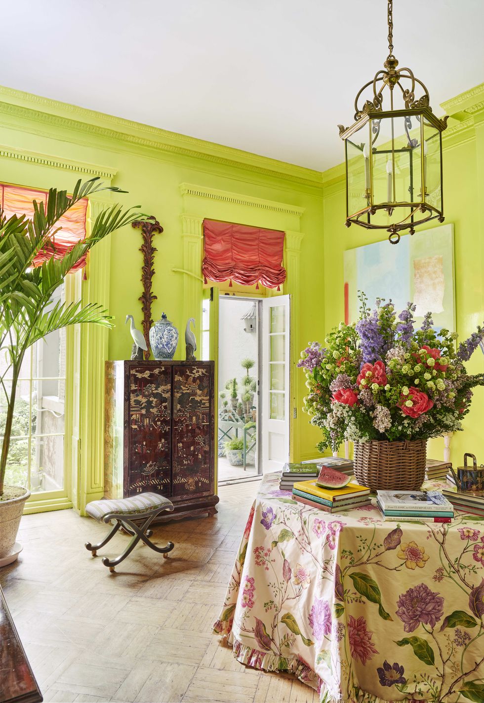
Let it be known that we are obsessed with chartreuse at VERANDA. Electrifying and joyful, the zippy shade is not for the faint of heart, but when it's deployed fearlessly, it's always the star of the show. The green-yellow shade works well in many different applications from upholstery fabric for chairs to lacquered hallways.

Author and art dealer Emily Eerdmans doused the upper salon of her New York gallery in a delicious chartreuse. Gentle details such as tasseled Austrian shades, a portiere hiding the kitchen, and monumental Christmas palms soften the electric walls.

6

Warm Neutrals

white bedroom ideas cece barfield thompson veranda bedroom decor ideas 2023
Thomas Loof

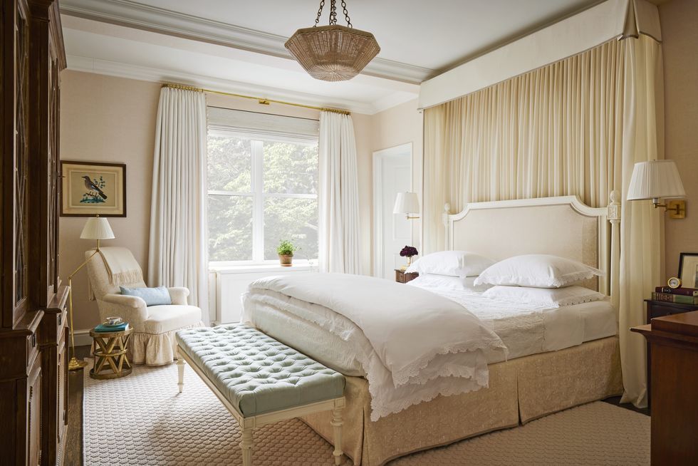
"Warm, neutral paint colors are having a moment as well. Along with bringing warmth and versatility to a space, a neutral paint palette can instantly make a room feel cozy and comforting. Some of my favorite neutrals are Neutral Territory, a sandy beige with subtle red undertones, and On Point, an airy greige that gets brighter in natural light. Consider a rich neutral for a high-traffic area of your home, like your living room, for a versatile shade that will work with a variety of decor styles while creating a more inviting ambience." —Nicole Gibbons, Founder of Clare

Here, sheer panels (Clarence House) and linens (Julia B) in a creamy white tones create the a serene retreat in CeCe Barfield Thompson's bedroom. The designer’s bed is skirted in a printed floral linen (Lisa Fine Textiles).

Headshot of Sarah DiMarco
Sarah DiMarco
Associate Editor

Sarah DiMarco (she/her) is the associate editor at VERANDA, covering all things design, architecture, art, gardens, jewelry, travel, wine and spirits. She also manages social media for the brand.

Watch Next
 
preview for HDM All sections playlist - Veranda US:
Advertisement - Continue Reading Below

Color Ideas

fresh shades of apricot and aqua awaken a ground floor kitchen and breakfast room

65 Best Paint Colors to Update Your Kitchen Now
home exterior with carriage style garage doors

12 Exterior Paint Colors That Can Look Cheap
gidiere exterior front house alabama

8 Expensive-Looking Exterior Paint Colors
2271 colonial williamsburg nelson galt house

The Best Bedroom Paint Color for Your Zodiac Sign
Advertisement - Continue Reading Below